これは GMOペパボディレクター Advent Calendar 2022 17日の記事です。

上記のような感じで、時系列かつ複数の要素が同時に起こるデータを動画化してみたので、その作成過程を記載する。
(自分の手元では確認したのだけど、動画ちゃんと動いているかな…)
例えば、どのような検索キーワードが合わせて検索されることが増えているか、社内でどの部署同士の結びつきが強くなっているか、などの可視化に使えそうなイメージをしている。
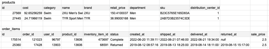
ここではBigQueryの公開データセット theLook eCommerce を例として使用させていただいた。theLook eCommerce は架空の衣料品サイトにおける商品や注文等のデータが格納されているので、ある商品分野(「シャツ」「ジーンズ」など)の商品の併せ買いのされやすさの変化を可視化してみる。
データの前処理
使用したのは theLook eCommerce の productsテーブルとorder_items テーブルの2つ。
年月単位で、同時注文したカテゴリの組み合わせ別に注文数を集計する。
WITH duplicate_order_combinations AS(
  SELECT
    order_items.order_id,
    DATE(TIMESTAMP_TRUNC(order_items.created_at, MONTH)) AS created_at,
    CASE
      WHEN products_destination.category IS NULL
        THEN products.category
      WHEN products.category < products_destination.category
        THEN CONCAT(products.category, "-", products_destination.category)
      ELSE CONCAT(products_destination.category, "-", products.category)
    END AS categories,
  FROM
    bigquery-public-data.thelook_ecommerce.order_items
  INNER JOIN
    bigquery-public-data.thelook_ecommerce.products
    ON order_items.product_id = products.id
  LEFT JOIN
    bigquery-public-data.thelook_ecommerce.order_items AS order_destination
    ON order_items.order_id = order_destination.order_id
    AND order_items.product_id != order_destination.product_id
  LEFT JOIN
    bigquery-public-data.thelook_ecommerce.products AS products_destination
    ON order_destination.product_id = products_destination.id
),

order_combinations AS(
  SELECT
    order_id,
    created_at,
    categories,
  FROM
    duplicate_order_combinations
  GROUP BY
      order_id,
      created_at,
      categories
)

SELECT
  created_at,
  SPLIT(categories, "-")[offset(0)] AS category,
  CASE WHEN categories LIKE "%-%"
    THEN SPLIT(categories, "-")[offset(1)] ELSE NULL END AS other_category,
  COUNT(*) AS _count
FROM
  order_combinations
GROUP BY
  created_at,
  categories
以下のような感じで集計される。以下のレコードだとAccessoriesとOuterwear & Coatsの同時購入が2020-05に20件あったということになる。
created_at, category, other_category, _count
2022-05-01, Accessories, Outerwear & Coats, 20
この結果にdataという名称をつけておく。
また、カテゴリの一覧も取得してcategoriesという名称をつけておく。
SELECT distinct(category)
FROM bigquery-public-data.thelook_ecommerce.products
グラフ化
グラフを扱えるNetworkX と可視化を行う Matplotlib を使用してグラフ化している。
以下の環境で実行を確認した。
Python 3.8.16
networkX 2.8.8
pandas 1.3.5
matplotlib 3.2.2
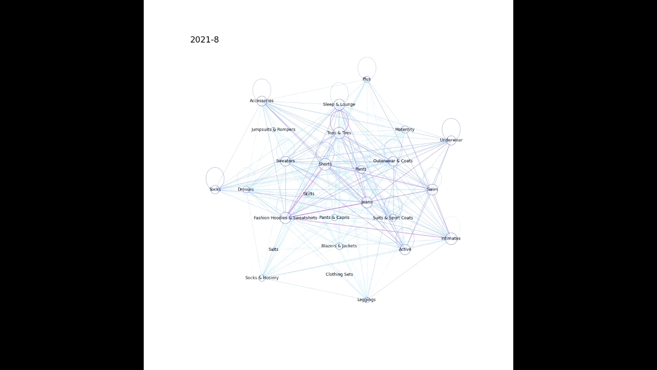
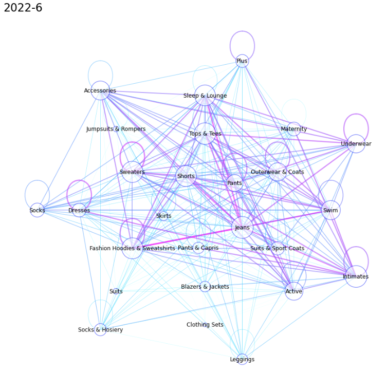
大まかな流れとして
1. ノード(今回だと購入した商品のカテゴリ)とエッジ(今回だと同時に購入した商品のカテゴリをつなぐ)を作成する
2. ノードとエッジを描画する(多い組み合わせほど太いエッジとなるようにし、同じカテゴリで複数購入された場合は同じノードを環状につなぐようにした)
import networkx as nx
import pandas as pd
from matplotlib import pyplot as plt

nlist = [
  ['Pants', 'Shorts', 'Skirts', 'Pants & Capris', 'Jeans'],
  ['Tops & Tees', 'Sweaters', 'Fashion Hoodies & Sweatshirts', 'Blazers & Jackets', 'Suits & Sport Coats', 'Outerwear & Coats'],
  ['Jumpsuits & Rompers', 'Dresses', 'Suits', 'Clothing Sets', 'Active', 'Swim', 'Maternity', 'Sleep & Lounge'],
  ['Socks', 'Socks & Hosiery', 'Leggings', 'Intimates', 'Underwear', 'Plus', 'Accessories']
]  # 使用しているshell_layoutの引数 nlistで同じリストに属するカテゴリが同じ円状に配置される


def make_graph(data, term, categories, origin_column, destination_column):
  data_internal = data[data[destination_column].isnull()]
  data_external = data[~data[destination_column].isnull()]
  G = nx.Graph()

  # nodeの作成
  for category in categories:
    counts = data_internal.query(f'{origin_column} == @category')['_count'].values
    if len(counts) > 0:
      G.add_nodes_from([(category, {'count': counts[0]})])
    else:
      G.add_nodes_from([(category, {'count': 1})])  # 単品での購入が行われていない場合

  # edgeの作成
  for origin, destination in zip(data_external[origin_column], data_external[destination_column]):
    weight = data_external.query(f'{origin_column} == @origin and {destination_column} == @destination')['_count'].values
    if len(weight) > 0:
      G.add_edge(origin, destination, weight=weight[0])
    else:
      G.add_edge(origin, destination, weight=0)

  return G


def plot_graph(G, term, nlist):
  # graphの描画
  plt.figure(figsize=(15, 15))
  pos = nx.shell_layout(G, nlist=nlist)

  node_size = [d['count']*8 for (n, d) in G.nodes(data=True)]
  nx.draw_networkx_nodes(G, pos, node_color='w', edgecolors='b', alpha=0.6, node_size=node_size)
  nx.draw_networkx_labels(G, pos)
  edge_width = [d['weight']*0.08 for (u, v, d) in G.edges(data=True)]
  edge_color = edge_width / max(edge_width)
  nx.draw_networkx_edges(G, pos, alpha=0.6, edge_color=edge_color, width=edge_width, edge_cmap=plt.cm.cool)

  plt.axis('off')
  title = f'{pd.to_datetime(term).year}-{pd.to_datetime(term).month}'
  plt.title(title, loc='left', fontsize=24)
  plt.savefig(f'{title}.png')


for month in data['created_at'].unique():
  data_month = data.query('created_at==@month')
  G = make_graph(data_month, month, categories['category'], 'category', 'other_category')
  plot_graph(G, month, nlist)
以下のような感じで月毎に画像が生成される。
動画化
動画への変換は OpenCV を利用した。上記で月毎に画像を生成した際、年月をタイトルとして保存してあるので、その順で重ねて動画にしている。
import cv2


def movie_export(prefix):
  fourcc = cv2.VideoWriter_fourcc('m', 'p', '4', 'v')
  video  = cv2.VideoWriter(f'{prefix}_movie.mp4', fourcc, 6.0, (1080, 1080))

  for month in sorted(data['created_at'].unique()):
    title = f'{pd.to_datetime(month).year}-{pd.to_datetime(month).month}'
    img = cv2.imread(f'/content/{title}.png')
    video.write(img)
  video.release()


movie_export('category')
次のような動画が生成される。